
BT
Re-imagining BT’s digital offerings across surfaces
💬
Role — Product designer
Tools — Sketch, Principle
Project type — 0-1 Launch
As part of BT’s digital transformation there was a push to review current services available to customers, with a focus on fixing current user issues and overall experiences with the updated brand.
I led the end to end design to re-imagine how BT’s My Account section for SME b2b customers could be transformed
My responsibilities — Product thinking · Visual design · Interaction design · Client facing
My role as product design lead
Utilise insights to understand business goals and user needs
Drive product thinking and stakeholder alignment
Lead collaborative sessions with team and stakeholders
Own end to end interaction and visual design

Deliver high quality files and guidance for engineering
CHALLENGES
Out with the old in with the new (almost)
As BT moves towards a digitally focused way of working and simultaneously undertakes a re-brand it is a challenging time as we work without a design system, across multiple and often old systems and rely on a heavy use of APIs.
Researching the problem
The project kicked off with a workshop which included the product owner, multiple stakeholders and myself. This provided a forum to understand the desire for change and gave the opportunity for stakeholders to share with me key user feedback, analytics and insights. The main business objective was to improve the experience and therefore reduce calls to the call centre agents. This initial session surfaced constraints such as platform capabilities and the current set up of user profiles and permissions. With the intention to improve the product held back by technical restrictions, some solutions I would explore would ultimately go into the backlog as improvements as and when technology allowed.
I also carried out a critique on My Account to both understand the product in more detail and surface any other areas for improvement.
Research outcomes
Using the insights, data, feedback and my critique I was able to highlight the following key areas for improvement:
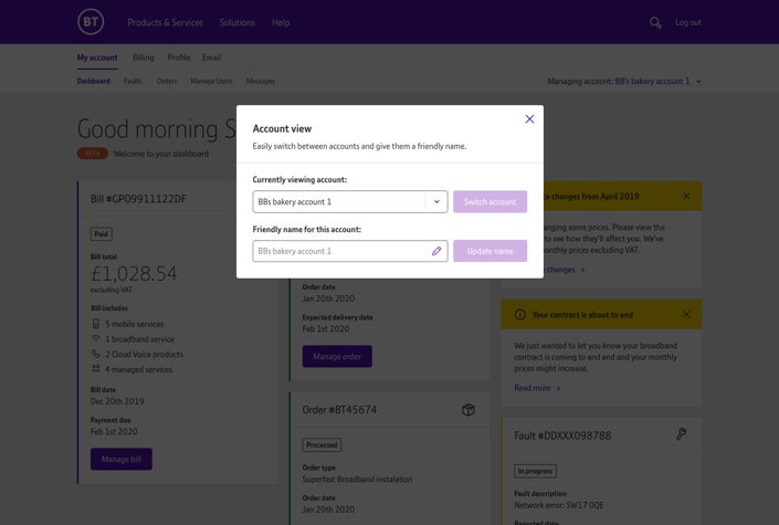
Explore alternatives for the account selection
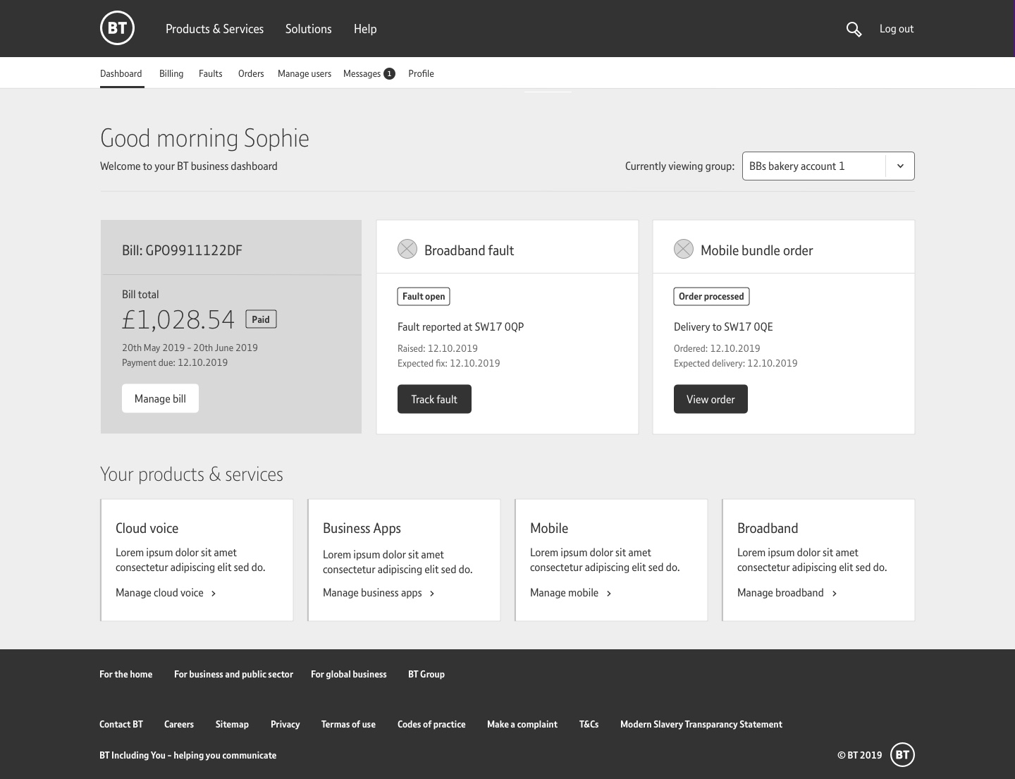
Research showed users did not understand they needed to perform the task of selecting an account to load its relevant content. As nothing appeared on the page if the user did not perform this interaction it appeared as though the content was missing or had not loaded properly. My objective was to simplify this.
Re design the navigation
Although the navigation performed well in terms of statistics, I was pretty certain this was due to the fact it was the only visible items to the user upon entry. My objective was to focus on how the navigation could be re structured for a better experience on this page and subsequently be used in other areas of ecosystem.
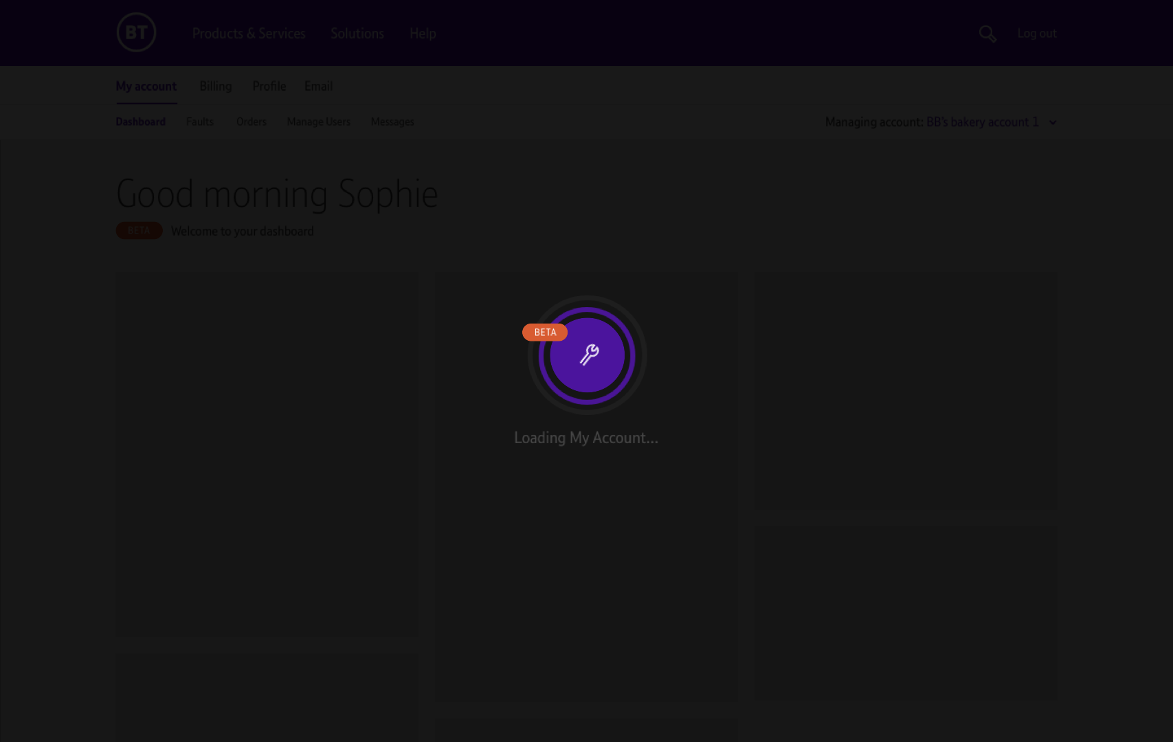
Consider a better approach to loading
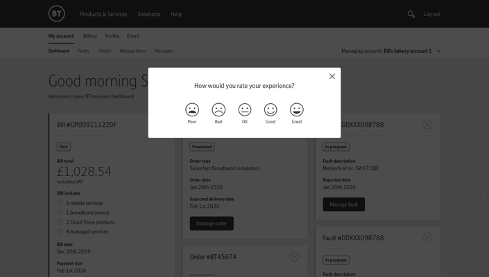
Analysis showed the multiple loading animations on the page was both distracting and confusing. My objective was to explore removing the multiple use of loaders and decide on a new way to indicate content was loading.
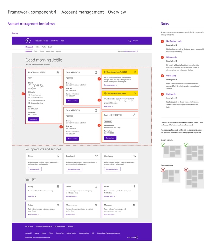
Surface more relevant content
Research showed users would almost instantly use the navigation to jump out to another part of the site. It was clear that the content users wanted was not visible on this page. My objective was to explore how APIs could be used to display more meaningful and helpful content to the user.
Create a better page hierarchy
Data showed the some sections of the page were almost never interacted with. My objective was to re-design the layout of the page, remove unnecessary content and options that showcased meaningful content.
Improve the visual design
The general feeling was the site was out dated and off brand. My objective was to create a visually appealing and on-brand style. I also wanted to explore ways to give a friendly and welcome approach that would make the experience feel more personal.
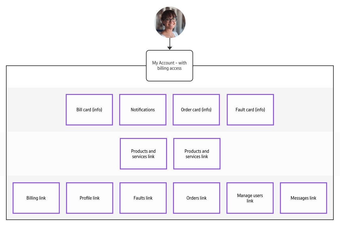
Information architecture
My Account sat on a platform alone from other key areas of the ecosystem. Areas such as billing, faults and orders all sat on different platforms and users were taken to these platforms through the My Account portal. I mapped the information architecture of the experience with its various entry and exit points and links to other platforms. Unfortunately, due to current platform restrictions the new dashboard experience would continue to stand alone from other parts of the wider ecosystem and follow a similar IA. Eventually the aim is to focus on a single platform that would house billing, faults and orders as well as other key areas of the business. A single platform experience would create a streamlined user experience, however, in the mean time we needed to use APIs to pull in relevant content from these other platforms.
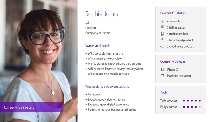
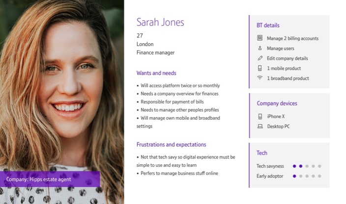
Defining the user
I created two primary personas that were used to focus design decisions and understand what information would be surfaced to users with different permissions. They were used as a basis to showcase motivations and frustrations of two specific user types; one with billing access and one without.

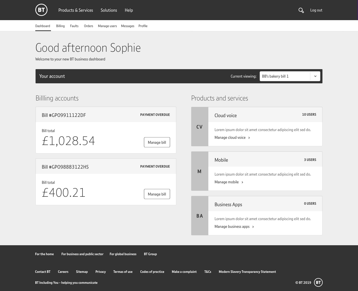
Initial concepts
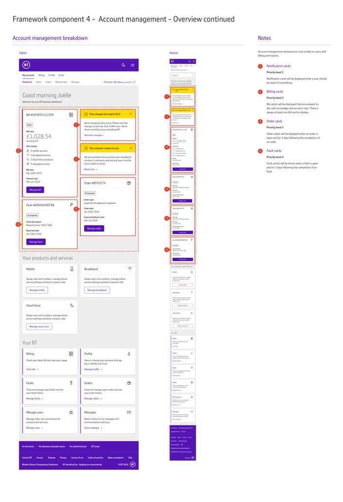
I explored concepts around the key objectives outlined in my research. I continually used these objectives to drive conversations, presenting solutions for both key components such as navigation as well as focusing on how the individual elements tied together as an experience. These concepts formed the basis for internal discussions and allowed the BA to determine if the APIs could indeed drive the data for the experience I proposed. Initial wireframes were created for the desktop experience as data showed 86% of users accessed the product via this device.
Limitations
Tech feasibility limited my design solutions, such as implementing a side navigation. At a stage where a single platform was not possible a side nav would created a visual experience that did not make sense when a user entered the other platforms. A side nav would be re-visited when BT’s drive for a single platform experience is realised.
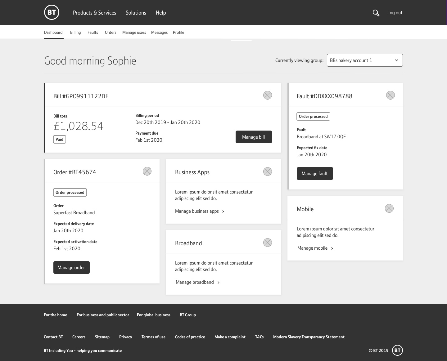
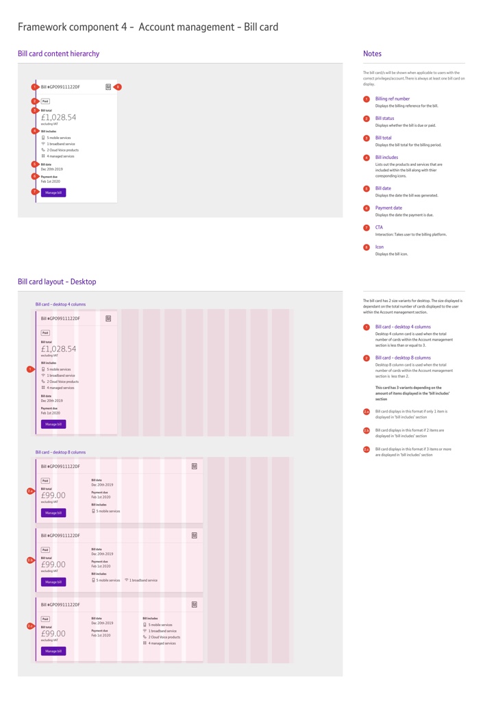
Mapping the content hierarchy
After initial dashboard exploration I decided to create a content hierarchy map for our two personas to ensure we were surfacing the correct content for both user types; one with and one without billing access.

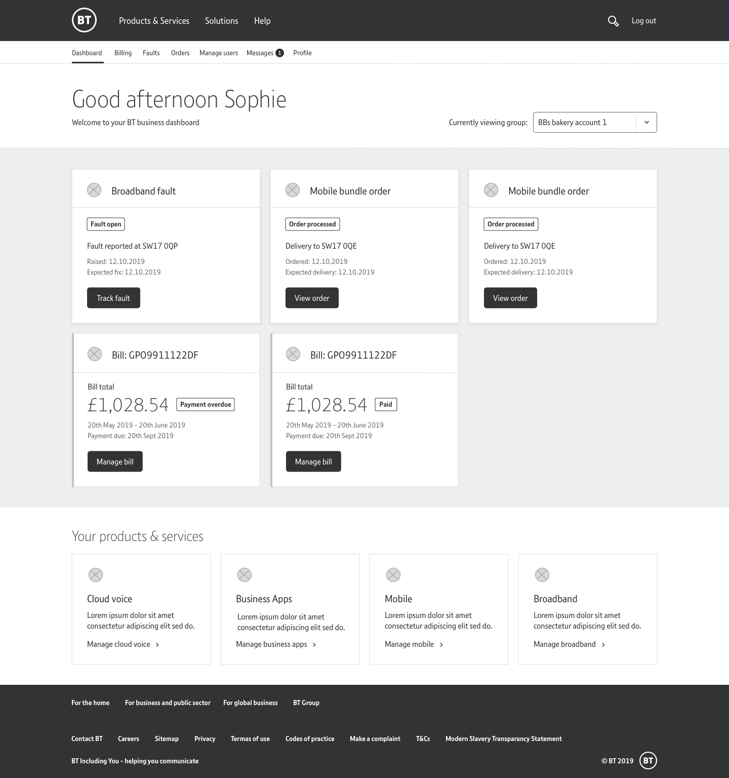
Wireframes and iterations
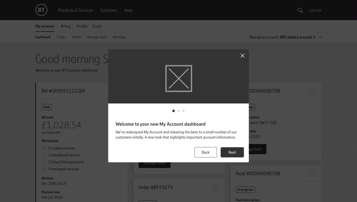
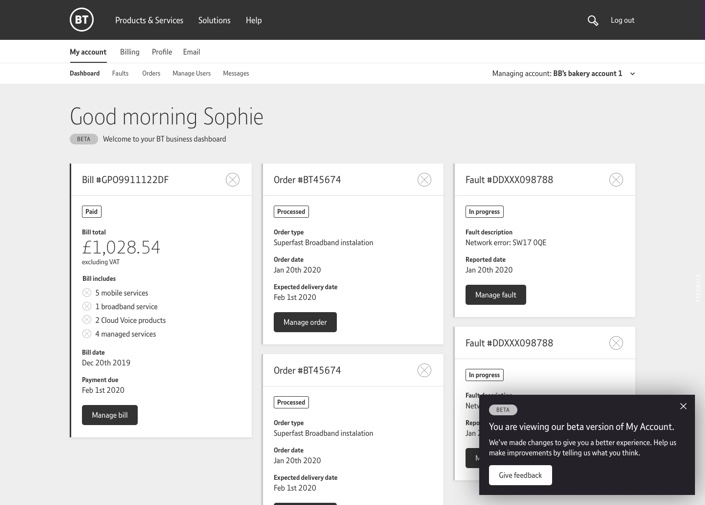
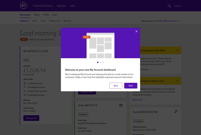
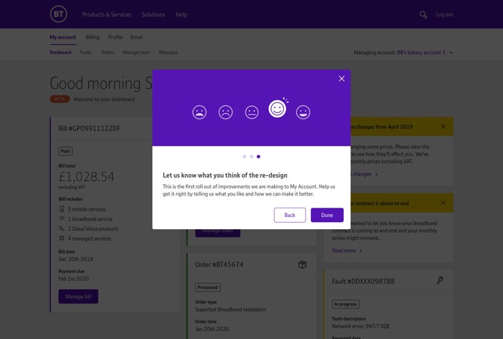
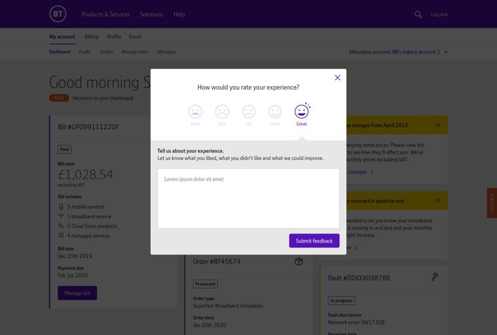
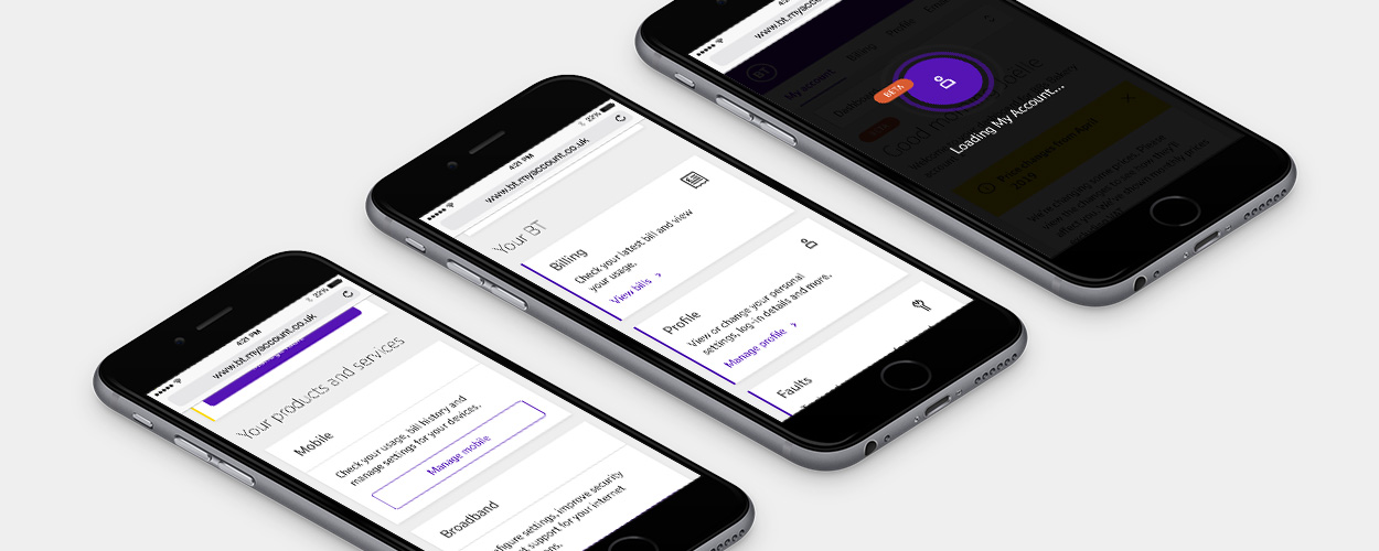
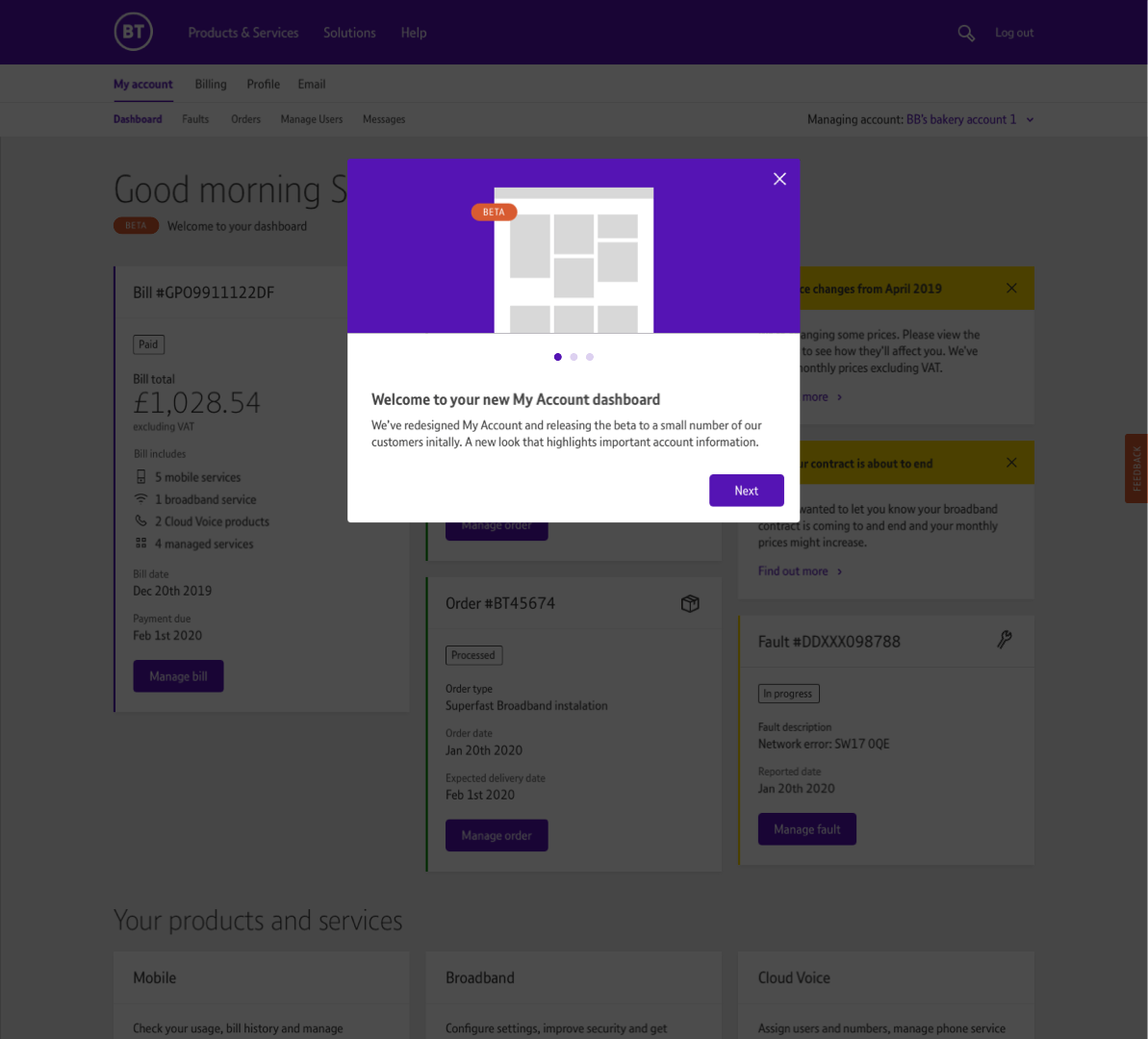
The low fidelity designs were constantly adjusted to meet the evolving requirements, API limitations and a beta release plan proposed by the product owner. After focusing on key components and page layouts for my initial design concepts I was then able to focus on the detail of experience. It was my responsibility to decide how to build the best experience and I pushed forward to explore how we could enhance the experience using loading screens, welcome on-boarding and feedback components.


Improving the UI
Before creating high fidelity visuals it was important to assess the current brand guidelines. BT do not currently have a design system which allowed me to explore various styles for the dashboard whilst using the current font hierarchy and colour palette to fit with the brand. Delivering a consistent feel to the product was key to my UI concepts but the flexibility allowed me to have a lot of creative freedom in the final UI, where I introduced many new styles and components that sat comfortably within BT’s existing brand.

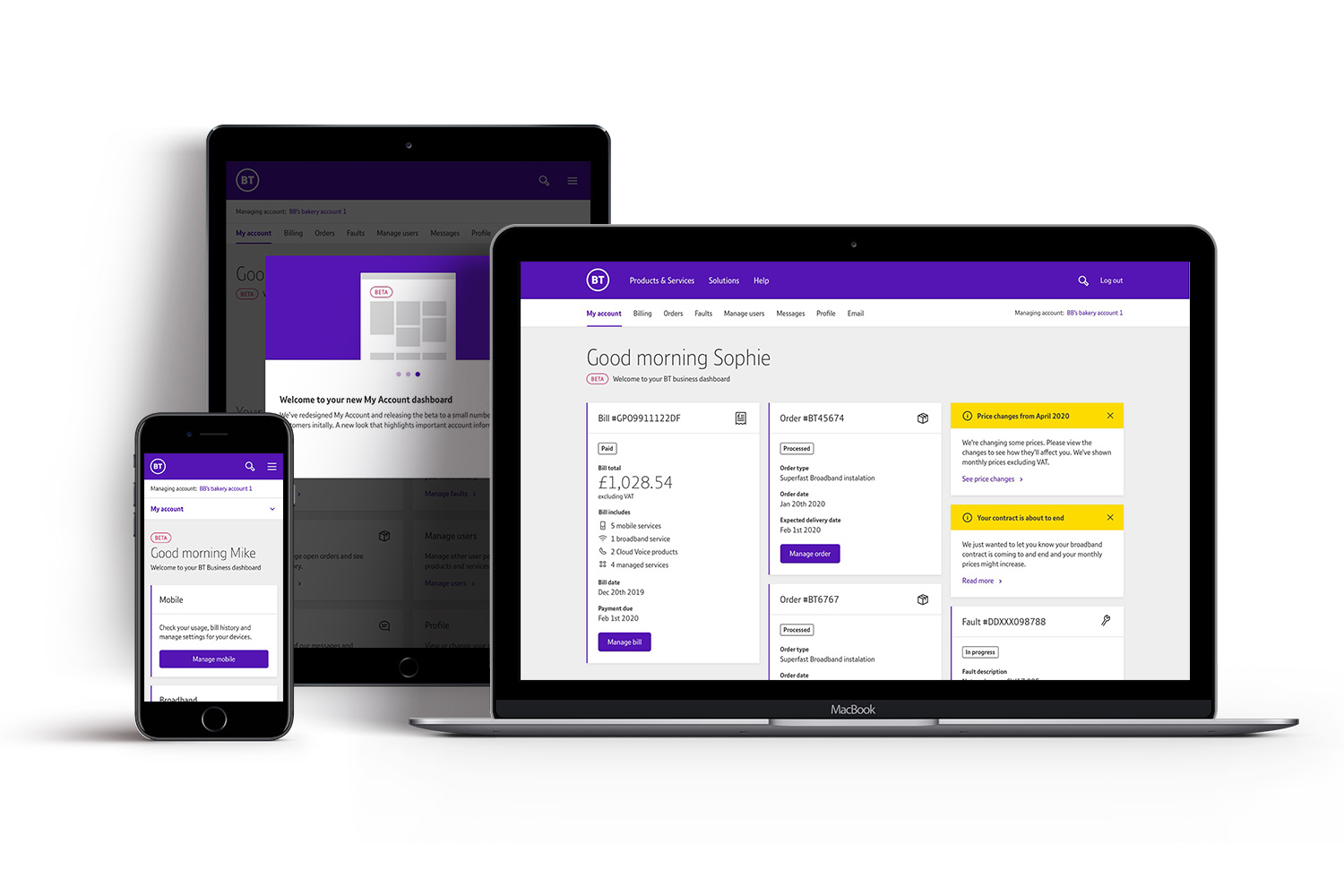
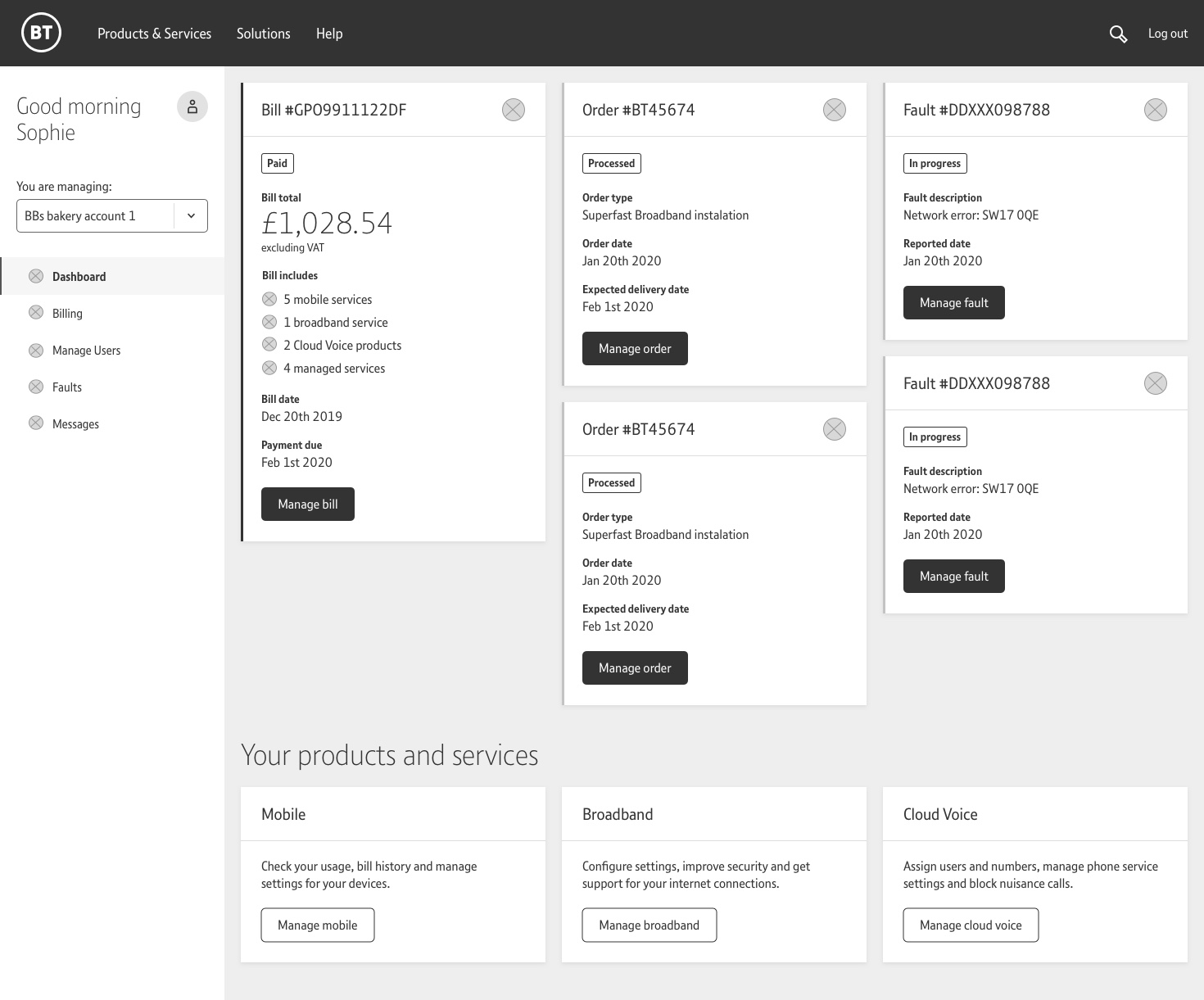
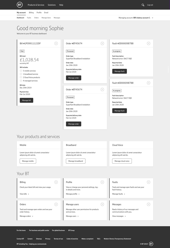
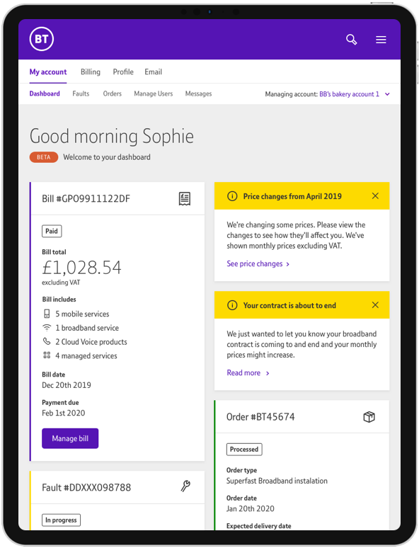
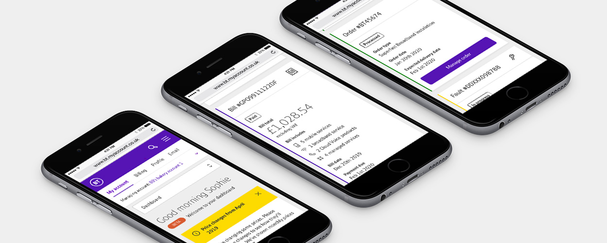
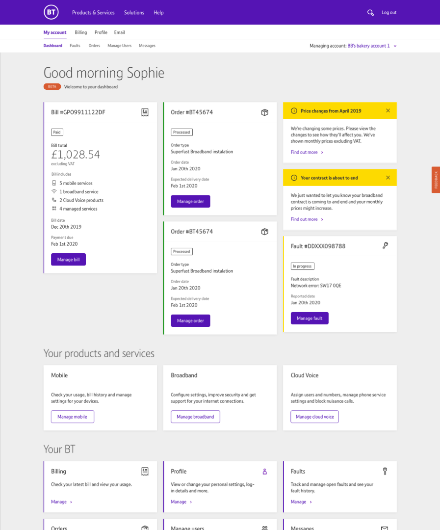
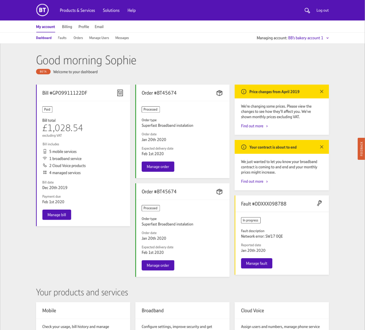
Sophie’s My Account dashboard


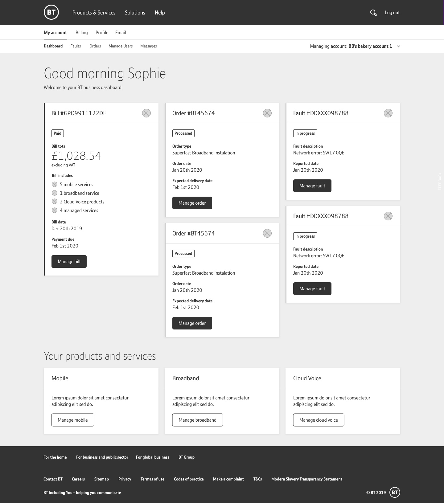
Mike’s My Account dashboard

Stakeholder management
With multiple stakeholders invested in the project it was important to regularly present working ideas to them either in person or via video calls. I often gathered stakeholders together to gain missing information, highlight blockers and drive the project forward. With some stakeholders having ideas and suggestions, it was key to take on board their wishes as well as explaining the rationale for my decisions throughout the process.
Prototyping & testing
After creating high-fidelity prototypes in Invision, we used them ensure we had met user goals and highlight areas for improvement. It was clear that to create a truly impactful new experience it needed to become a seamless journey for the user where they did not have to access multiple platforms from the dashboard. Navigation inconsistencies across multiple platforms continued to cause issues for users.
Delivery
Working with the development team in India I communicated the changes to the product using calls, confluence pages and Invision. Confluence was used to house UX documents, to demonstrate how the dashboard was structured and how components re-stacked at different breakpoints. These documents also broke down components and detailed the elements they were formed from and when certain variants should be used. Invision files were provided for the UI of page layouts, components and product specific design system elements.
Working across boarders
I am responsible for delivering work to development teams in more than one location. To ensure a good working relationship with the remote teams we used Jira to track progress, Invision for creating prototypes and sharing UI, Confluence to house links and documents, and daily Skype or Teams calls to communicate progress and highlight blockers.
Role — Product designer
Tools — Sketch, Invision, Zeplin
Project type — 0-1 Launch
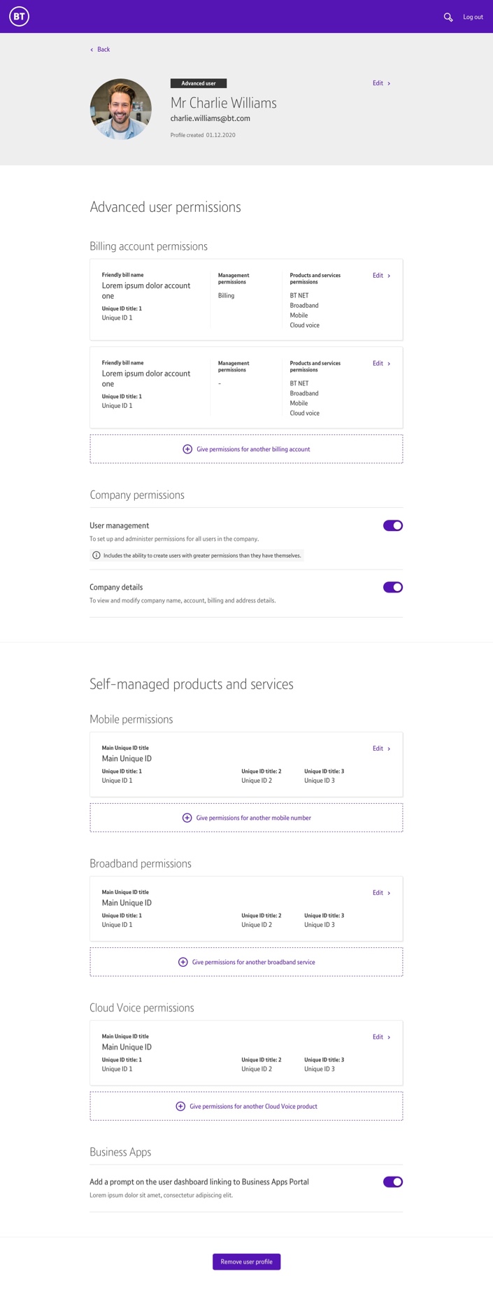
For BT’s SME b2b customers there was a growing need for businesses to give their employees permissions across a number of products BT was supplying.
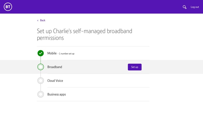
The challenge was to design a new ‘profile creation’ journey that has the ability to give a high level of granularity for these permissions.
For this project I partnered closely with another UX designer. We split the work, focusing together on UX flows whilst he led research sessions and the majority of stakeholder interactions whilst I took ownership of the building out the flows, UI design and delivery to engineering teams.
My responsibilities — Product thinking · Visual design · Interaction design · Client facing
My role partnering with another UX lead
Utilise data and insights to understand business goals and user needs
Drive product thinking and stakeholder alignment
Work closely with UX partner and lead collaborative sessions with team and leadership
Own end to end visual design and delivery
Deliver high quality files and guidance for engineering
Researching the problem
We could not use data to drive the project as this was a totally new journey for BT. In its current for there was no capability to tailor the permissions of users, which meant all users could access all the sensitive information the main user of the account could see, whatever their position in the company. Creating granularity for permissions would ultimately allow us to create personalised dashboard experiences where relevant information would be specific to the individual needs of a user. It quickly became apparent that the level for managing a users permissions were dependant on a number of factors that would inform how we designed the experience.
Research outcomes
It was clear through our gap analysis and knowledge shared by the stakeholders that the ‘profile creation’ could become quite lengthy and complex process. In order to fulfil the brief the following items would need to be considered:
- Ability to give permission to access bills
- Ability to give permission to manage other users
- Ability to give permissions to access and manage BT products and services
- Ability to give a user permission to change their own product and service settings such as a mobile device
- A clear use of language – as this experience would be new to all users
Defining the user
Before we started on design we create a primary persona Charlie who would become the new user, enabling us to understand the granularity needed for a specific set of needs on the platform. Our secondary persona Sarah would highlight the motivations and frustrations of a user who had the task of setting up a new user

Mapping the journey
We created journey maps to test different solutions for the ‘profile creation’. We were concerned with the length and complexity of setting up the user and wanted the journey to be as simple and clear as possible. With backend limitations not fully ironed out multiple options were taken into the wireframe and prototype stages allowing us to progress whilst the business requirements and backend logic were defined.
Wireframes and iterations
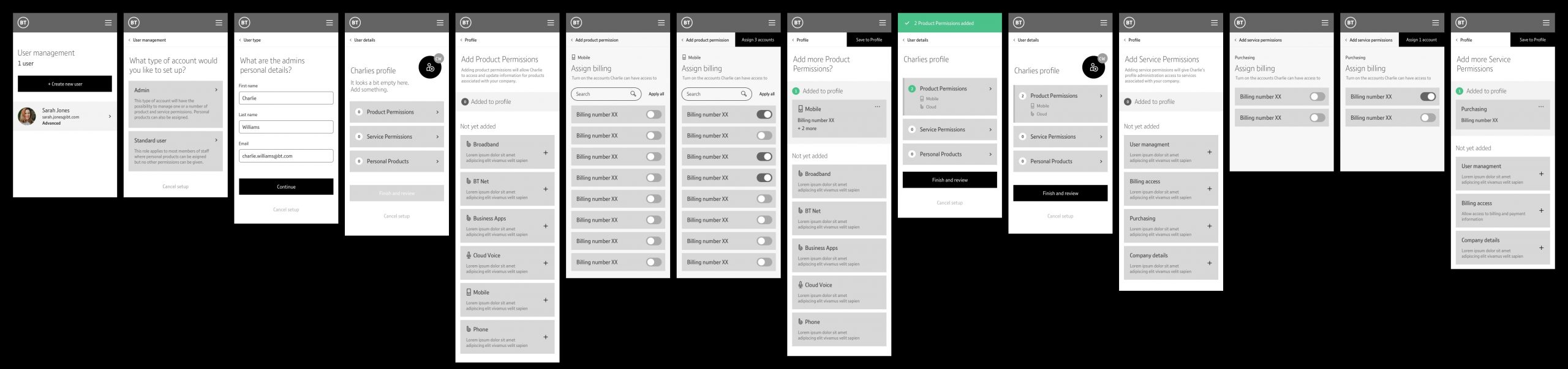
We created sketches and wireframes, focusing on the user flow through the full set up of a new user. Early on we were able to pin point specific types of screens that would be needed in the flow which were:
- User management screen
- Enter details
- Bill, product and service selection
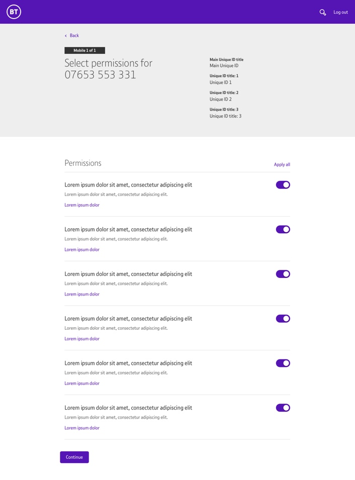
- Permission specific (toggles)
- Review
- Edit
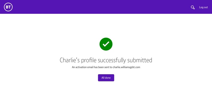
- Success
- Profile
Due to the complexity, amount and the possibility of longer length screens it was decided a mobile first approach would be best to ensure the experience worked for all devices. The bulk of the work and iterations centered around understanding the best order to present the screens to the user, so the experience was manageable.


Stakeholder management
We ran a lot of sessions with a wide range of stakeholders who had invested interest, as this new feature would form the basis of the future of the My Account interface. The client wanted to see the options for different journeys in low fidelity wireframe form. These were used both as a basis to refine the journey and clarify what level of granularity was needed and what permissions the individual stakeholders stakeholders wanted to present.
Low fidelity prototyping
As we explored variants for the user flow of the ‘profile creation’ we did lots of guerrilla testing using low fidelity prototypes. This allowed us to rapidly test and present our findings to the stakeholders. We always created a video to help us walk the stakeholders through the options.
ROUTE 1
Building the profile screen
This solution was the most compact and natural building mechanism of a profile.
Flow
After entering the personal details of the new user a profile holding screen would be created. This profile holding screen formed the basis of the subsequent journey, allowing the user to add permissions and continually return to this screen to see the profile build. Lastly, they reviewed and saved the profile.
Tech limitations
Whilst we initially presented concepts for the journey that saw the billing and products as separate entities, tech validation of backend and APIs revealed that products were in-fact tied together with a bill. Journeys were altered to accommodate this change.
ROUTE 2
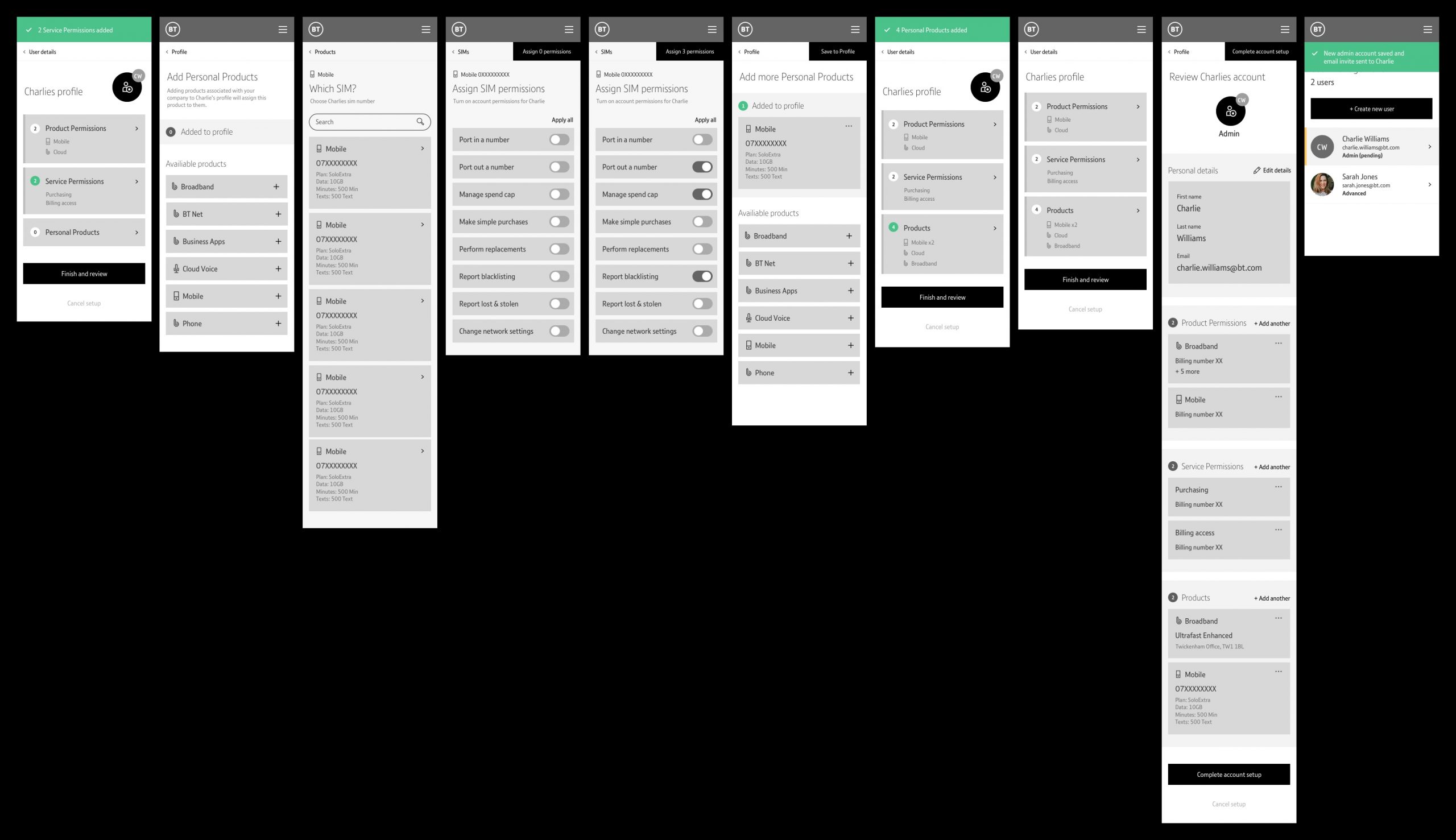
Linear journey with regular success screens and a multi-select for personal products
This solution helped to navigate a user through the long journey with success and reduced interactions with the multi-select.
Flow
After entering the personal details of the new user, the rest of the journey would continue in a linear path. Success screens were introduced at regular intervals guiding the user when they had completed a section. Personal products would be a multi-select screen that reduced the amount of user interactions needed. Lastly, they reviewed and saved the profile.


ROUTE 3
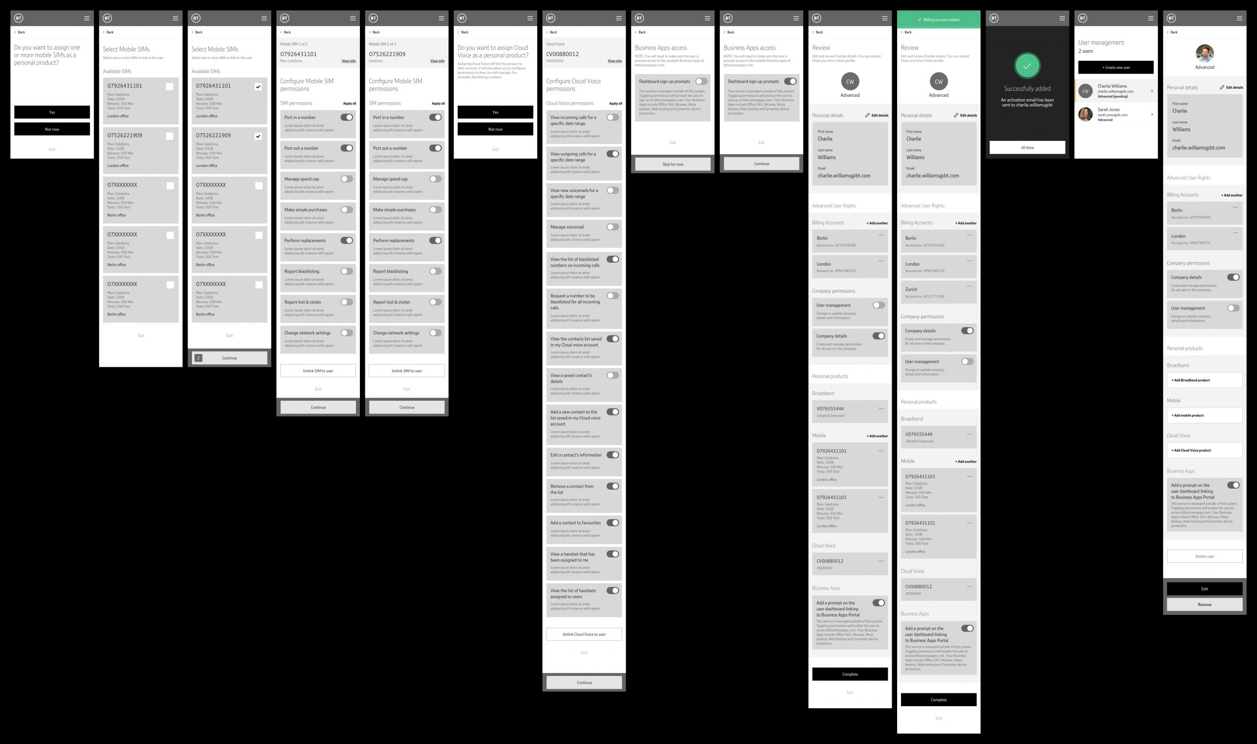
Question by question linear journey
This solution was the longest journey but the most straightforward to use when tested with the stakeholders.
Flow
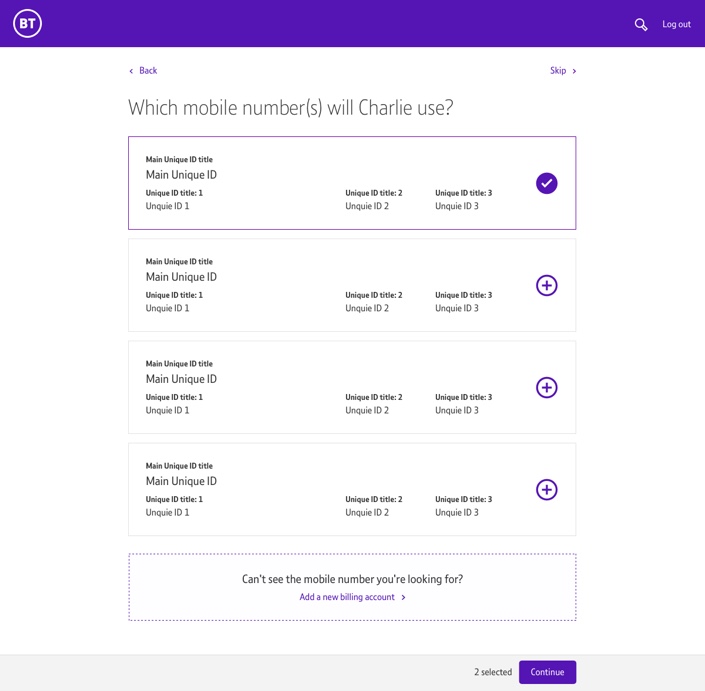
After entering the personal details of the new user, the rest of the journey would continue in a linear path. The name of the new user (in this instance Charlie) would be the focus for each section. Charlie was asked if they wanted permissions to billing/user management/broadband etc, with yes or no answers for each. Lastly, they reviewed and save the profile.

Combining routes together for the final journey
After many stakeholders discussions it was decided to combine some of the options for flows we presented. They opted to have Route 3’s question by question linear path and the use of using the name to focus the task of each section, with Route 2 ‘s multi-select for personal products. The final user journey map was quite extensive due to number of the decisions and permission possibilities.

User interface design
I took ownership for the UI across desktop and mobile and had worked on in tandem whilst we were working through UX iteration. I focused on creating a simple UI that reduced any unnecessary visual distraction.

Sarah creating…

…Charlie’s profile


User testing
We tested high-fidelity designs with real users in a testing lab with 6 users. I watched the sessions live whilst the UXR lead ran the sessions, taking notes and comparing against our predictions. A user test report was created on the basis of the testing.
What tested well
- All participants were able to successfully complete the journey
- Participants could express at the end what they had done in the duration of the profile creation
- Patterns such as toggles, multi-select and sticky footers tested well
What did not test well
- The terminology used confused the user
- Location skip section CTA at the top was often missed
- The review screen edit CTAs were often overlooked
Although testing highlighted areas for improvements, there we no huge issues. As we also received sign off from BT’s brand guardian it was decided we would press ahead and deliver designs for development.
Delivery
We delivered both pixel perfect components as Zeplin files, and UX decisions, journeys and interactions on Confluence.
